Home » Posts filed under Comparisons
Posted by
Unknown on Tuesday, February 21, 2012
These two are incomparable for some and incredibly close for others. On the left we have OPI Pepe's Purple Passion and on the right OPI We'll Always have Paris. Pepe's Purple Passion was released with The Muppets collection last Christmas and Paris was released a few years ago from OPI's France collection. I think it may be a part of the main line though.
Very minor differences. Pepe has very small flakie pieces and is a fraction lighter but the shimmer isn't really all that obvious. Then we have Paris who is a beautiful deep raisin creme.
Late last year I was dying for this colour but now I think I don't need both.
What would you do?
Posted by
Unknown on Tuesday, February 14, 2012
I know it's a bit of a stretch to compare these two, but I feel like I need to get rid of one of them.
Uh-Oh Roll Down the Window is from OPI's latest fall collection, Touring America (2011). Trendsetter is also from China Glaze's latest fall collection, Metro (2011). So both are fairly easy to come across.
Formula wise the OPI is quite watery and at the other end of the scale is thick-goopy Trendsetter. I have added thinner to it before but the next time I went to use Trend, it was just as thick as before.
I appreciate Trend's different-ness and Uh-Oh to me is a collection staple. Although it isn't as bold as Trend, it certainly looks nice, clean, subtle and will match a lot of outfits.
I just don't know what to do! What would you do? Are you in the same position but with other colours?
Posted by
Unknown on Monday, February 13, 2012
I love my sheer jelly pinks. These are the only two I have, but I am thinking about the future. OPI New York Ballet collection are all jellies. I'm going to try and get the whole set to review on Nail Juice. So that means I need to make room...
It's a Girl is on the pointer (left) and Spotlight is on the middle finger (right). Two coats of each. You can't fault either of them, they're both delicate glassy pinks that just make your nails look a million dollars.
It's a Girl gives you more of a milky pink build up and Spotlight is an extremely beautiful sheer pink, perfect for sprucing up tired or 'need a break from colour' nails.
Here is It's A Girl in all her glory. Girl was released two years ago and Spotlight was released just last year. So both are fairly easy to find.
I could't bare to part with either one. I might just have to wait for the Ballet's to compare them all!
Posted by
Unknown on Sunday, February 12, 2012
I'm purging the stash again, I need to make room for almost all of those OPI New York Ballets, a few Hollands, a few Electro Pops and hopefully the Misa Spring collection.
Designer De Better and You're Royal Shine-ness are too close to own both for my liking. No they aren't dupes, but you know, they're both silver foils and that's close enough for me.
Designer De Better is a lighter silver with rose gold speckles running throughout. You're Royal Shine-ness is a darker silver that has a deep green-gold base to it. They both give great coverage and I can't fault them on their formulas.
So I asked myself what I wanted them for. A silver foil that's going to pop with an outfit, well they'll both do that... so I went with Designer De Better, just because it has rose gold in it. I love rose gold.
Designer De Better was released in The Muppets holiday collection a couple of months ago, it'll be really easy to find. You're Royal Shine-ness was a special Serena Williams release and may be harder to find in store, but online will be a breeze.
Posted by
Unknown on Sunday, January 15, 2012
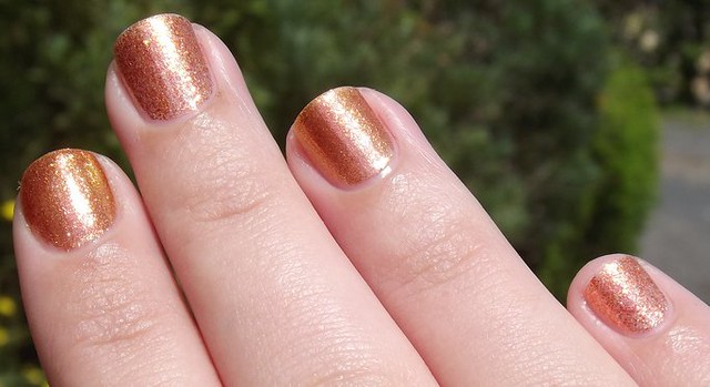
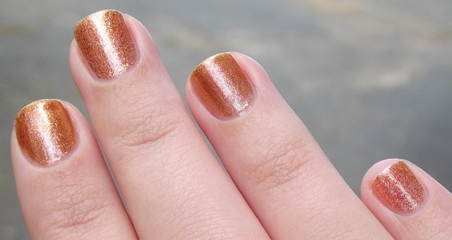
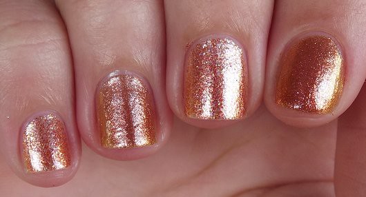
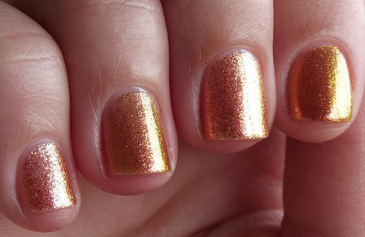
When Pros and Bronze was first released, it never occurred to me that there would be something already out there like it. We hardly ever get rose gold duochromey foils! But Pros has a very close relative... Color Club's Wild and Willing.Wearing: Pros and Bronze on pinky and middle, Wild and Willing on ring and pointer.
When looking at the bottles, you can find definite differences but once on the nail... it gets a little bit more tricky. This is both two coats of each shown here. Wild and Willing is a bit finer and has a green sheen. Pros and Bronze's pieces are a bit bigger and more sparse.
Wearing: Pros and Bronze on pinky and middle, Wild and Willing on ring and pointer.
They both share a lot of the same characteristics. They both turn gold when not in direct light. You also get more of a copper or pink shine when inside with different light sources. Wild shines green as well.
Pros and Bronze is a Serena Williams polish and is limited edition. Pretty easy to find at the moment, as is Wild and Willing. Wild was released a little while ago but it seems to be easy to find in chemists or online.
Really it all depends on what kind of foil you like and how many colours you like to see :)
Posted by
Unknown on Saturday, May 15, 2010
I did a little more digging through my folders and found these :)
Mintys: BYS Kung Fu Blue, Essie Mint Candy Apple, MAC Peppermint Patti, Chanel Jade
Purples: OPI Black Cherry Chutney, OPI Visions of Sugarplum, OPI Gotta Go Grape, Essie Sexy Divide
Well I had better make some breakfast before it turns to lunch time :D
Posted by
Unknown on Thursday, April 15, 2010
Ok so I thought I would compare the pinks together as I thought they were closer but really... they aren't :)
Lined up we have: Don't Think Just Pink, Lucky Lucky Lavender, I'm Ok You're Bouquet and Panda-monium Pink.
Don't Think Just Pink compared to Lucky Lucky is much more red to me and a little more squishy looking.
Lucky Lucky compared to I'm Bouquet again is more lilac toned. I'm Bouquet is quite a yellow toned pink.
I'm Bouquet compared to Pandamonium Pink is again more yellow and I guess softer looking. Pandamonium Pink is more stark, more pastel like.
My favourite shade out of all of them: Lucky Lucky Lavender. I think I will change For Audrey and put it on! First time I have worn polish for a little while, it's almost exciting again :)
Posted by
Unknown on Saturday, March 6, 2010
Posted by
Unknown on Sunday, June 14, 2009
Posted by
Unknown on Wednesday, April 8, 2009

Yay, Autumn's weather is finally kicking in. It has been raining on and off a lot today with thunder too! I like when it rains, but sadly my nail polish didn't. It didn't dry fully, I suppose it doesn't help when my fingers are as warm as an iceberg.I had been meaning to compare these three for awhile now. I love all three of these shades, all three are work appropriate and apply quite nicely.In order from top to bottom:Have A Tempura Tan-trumMiso Happy With This ColorLet Them Eat Rice CakeThey are a little streaky on coat number two but three fixes them right up. I tried them over a ridge filler to see if I could do it in two coats, no, ridge filler makes them more streaky lol. So, if you can put up with doing three coats, they are absolutely perfect.In the last photo you can see the Tempura is the more yellow toned one, Miso the red toned and Rice Cake being the blue toned one. I am positive that at least one of these would work for you!
Posted by
Unknown on Sunday, March 22, 2009
 Revvv is much more charcoalish than MPJ, but also much more opaque ;)
Please click the photos to enlarge!

Posted by
Unknown on Wednesday, March 18, 2009
 Two polishes that I wanted to compare for awhile now, OPI Sheer Enchantment and Color Club Femme Fatale.
They look like they have similar sort of shimmer although SE looks really gross in the bottle. They both have pink/orange shimmer that changes to purple/gold. Very nice.
So here they are with one coat and two coats over Where's The Soiree?
4th picture has got its labels round the wrong way n_n;
Sheer Enchantment - Much less visable than Femme Fatale. It is more glitter like with the size pieces.
Femme Fatal - I love this polish. I wore it over Morgan the other day... those two were made for each-other! Smaller pieces than SE and a lot more of them. I only used one coat of Femme Fatale on ALL pictures.
Posted by
Unknown on Friday, March 13, 2009
 I posted this on MUA awhile back and completely forgot about it until I was cleaning out NJ's folders.
Differences:
Little Tease is slightly more blue toned, sheerer, pearlised not frosted.
Suzi is more red, thicker, has a frosted not pearlised finish.
I messed it up on the third coat... Damn camera strap! Just incase anyone is confused... They gain a coat on each picture :)
Little Tease is an oldie, so I'm not too sure if it's discontinued or not. Suzi & The Lifeguard was brought out at the start of Feb in the South Beach collection.
Posted by
Unknown on Sunday, February 22, 2009
 Sorry for the weird angle, but it is necessary for these two colours as the camera can't pick up their shades properly :)
Two coats of each, Whitney is on the pointer and ring finger while Morgan is on the middle and pinky.
As you can see Whitney is more blue toned as to Morgan which is more red toned. Morgan is also jelly-ish unlike Whitney who is completely opaque.
Posted by
Unknown
 Snow White is on pointer and ring and Purity is on the middle and pinky :D
This is three coats of each.
Hardly any difference at all. But Snow White is the tiniest bit softer, Purity is more stark.
Posted by
Unknown on Tuesday, February 17, 2009
 Do You Lilac It? is on the middle and pinky and Done Out In Deco is on the pointer and ring fingers.
Each is two coats and they need it :D
You might be able to see (depending on your monitor) that DOID is more of a lavender pastel and DYLI is a pinker lilac.

Posted by
Unknown on Friday, January 23, 2009
Posted by
Unknown on Wednesday, January 7, 2009
 Alright I don't know about you but I'm sick of looking at Spontaneous lol so I have some Baby Blue comparisons for you n_nAs you can see they are all extremely similar, baby blue hued with gold shimmer. From top to bottom we have Misa's Radiant, OPI's Baby Blue and OPI's Beverly Hills Chills.I'm pretty sure Radiant isn't hard to come across (talking e-tailors here), I think it's part of their bright collection, not too sure on that. I don't know if you'd ever come across Beverly Hills Chills or Baby Blue. Someone on MUA has hit the jackpot with Baby Blue though, I think they found about 11 or something :D
 Ok, three coats of each colour. First photo is in the sun... actually all of them are :) Just different angles to show you the shimmah!
Last pic is a very close side by side comparison. I think I prefer Misa's Radiant out of the whole lot :/ The one that took the least amount of trouble to get lol